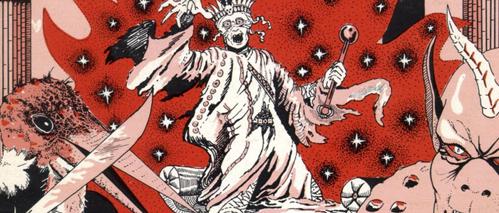
 Most RPG module art is useless – we should expect more from adventure art.
I recently reviewed the Dungeon Crawl Classics module Hole in the Sky, a terrific funnel adventure. Hole in the Sky has a full color front and back cover by Doug Kovacs, plus a generous amount of internal art from five different artists (including cartographer). The experience is a delight of visual richness – much of which goes wasted.
I am not intentionally picking on Hole in the Sky, but it reminded me of something I learned back in 1978 when TSR introduced D&D players to the Tomb of Horrors but subsequently forgot.
Tomb of Horrors is known as an incredibly deadly dungeon, but it offered something really neat: a separate art book of individual pictures the DM could show to the players.
That separate art booklet was amazing – not for the quality of the art, but that the art wasn’t simply a resource for my pleasure as a DM, but something I could use to make the adventure more fun for my players. That’s why I think so much adventure art is a waste. Why not make it more useful as a resource?
What a Separate Art Section Does
The DM can easily share these visual resources with players. This can be done with a quick flash of the art panel from behind a screen.
Art can also be photocopied and selectively distributed during play. This is particularly handy when there is a visual trick or trap and everything relevant is clearly visible to the characters but may have relevant details lost because of how players interpret a verbal description.
The GM can also elect not to share these art resources, or modify them to better fit a campaign setting. Back in the Tomb of Horror days, modifying art was much trickier, but you might be surprised what is possible with just a photocopier. Now with scanners or digital files available, removing or modifying art is a snap.
I am also only talking about adventure art, and not campaign books or rule books. Adventures tend to have a lower page count, and the text is only viewed by game masters. I wouldn’t necessarily suggest separate art for other types of game media.
Inset Visual Cues & Symbols
A follow up discussion about this article suggested that the body of text within an adventure needs to be broken up to ensure it is interesting to the GM. I can think of a few ways to do that without adding significantly to an art budget.
- The classic pink box of read aloud description and call-out text boxes for notes contain visual cues (color and box), even though they also contain text
- Mini-slide copies of art, such as you find in presentation tools, can be inserted into the text (having also an art number on it to match it up with the larger piece could be useful
- Small map sectionals inserted into place have visual impact and don’t add to cost
- Symbols, from simple stuff to the more complex elements already found in headers and footers, can break up text sections
- Drop Caps are visually appealing and can be either simple design tricks or full on pieces of art
More Consistent Art
Also, if most art is placed into a separate section, we may see better consistency in adventure art.
Give five artists the same written or verbal description, and you are likely to get five greatly different interpretations – some of which contradict each other. Put those designs side by side and I imagine the Art Director for the adventure module project will be forced to enforce greater consistency in style.
Should Player Ready Art Matter?
You tell me. I feel strongly enough about making the adventure art more useful to both game masters and players. What do you think?
An interesting idea. We just started doing short adventure modules for Fate and Ubiquity and that was one of my conundrums — do you make it visually interesting/give the GM a few pics to help set the atmosphere, or no?
The idea of breaking the art into a separate section might require some exploration…
I agree, I do think it would be more worthwhile having separate art to show players.
I did that in Kaigaku Chronicle Issue 1. There’s the two sections of the map for the GM, plus info, then a page with the map level pictures for players, with a secret passage removed. And pretty much all other art is only on pages where there are no GM secrets.
I did this very thing on RPGnow.com many years ago, called Artifacts of the Arcane, both Publisher art and ready made art for Player handouts, made as cards to distribute items and treasures.
http://www.rpgnow.com/browse/pub/475/V-Shane